
But this was too much for me.
©2005 Kohler, from the February 2006 issue of Cottage Living
Yeah, I owned a copy of Cottage Living. You wanna make something of it?
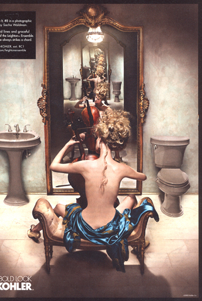
At first it's pretty. Then you realize she looks wrong. She looks kind of like someone tied her to that bench in the middle of that bathroom and told her to, "PLAY! PLAY DAMN YOU!" and refused to feed her. It MAY have been an effort to make her body echo the shape of the instrument... but it's kind of nasty looking.
So then you take a closer look:

See her reflection? The reflection of her hip area doesn't look quite so emaciated.


(Dude. How Blade Runner is this grainy close up? hee hee)
Up close you can see how someone has (a little too clumsily, in my opinion - I mean, her side just looks SILLY on the second image, right?) shaved a huge chunk out of her photo. Like she owed them a pound of visual flesh.
So while I'm still intrigued by the possibilities when it comes to digitally enhancing or altering photos for advertising - I think it's in poor taste to go around making women look like cellos. Scrawny, glorified, unhealthy cellos.
...Or, you know, WHATEVER that instrument is.
If anyone has trouble seeing the images - let me know! I may be having difficulty with my photo hosting thingy.


im thinking you have too much time on your hands if you noticed this! I am glad you did, thought... because none of us owe anyone a pound of us.
ReplyDeleteI guess I can see how it would look that way. It's just that print media is what I do for a living. People with MY job alter these photographs and fudge the perception of what is possible with our fancy computer software. I have always felt that making adjustments to the human body - when it isn't intentionally obvious (Lanvin ads are a great example of a more obvious and therefore more responsible approach) - is reckless and damaging.
ReplyDeleteIt's like the Dove commercial that made the rounds and that I posted on here. The average consumer doesn't always realize that NO ONE is that thin, that perfect, that surreally supple. It encourages unhealthy body images. I cannot help but notice.
I generally like the Kohler ads because they are visually arresting.
ReplyDeleteBut yeah, the whole "Let's make a difficult-to-achieve standard of beauty IMPOSSIBLE by airbrushing everyone and then not telling folks" kind of offends me.
Especially since I have the sort of bod that would have been revered in, say, the 1600s, but is categorically dismissed as "too fat" and too rounded these days.
/I think it's in poor taste to go around making women look like cellos./
ReplyDeleteHahahahahahaha!
But I TOTALLY look like that when I sit half-naked in my bathroom -- my bum draped in satin, my hair in a careless-but-gorgeous up-do with a perfect tendril floating down my back -- posed in front of a huge mirror so I can see myself to infinity while I play my cello.
You know, that's EXACTLY what I was thinking when I looked at this: "NOBODY looks like this... well, except maybe Tracey. But for anyone else this is such an unreasonably high standard." ;)
ReplyDeleteHAhahahahaha!
ReplyDeleteI also like that there is a cut into the side of the cello in the pic where they did so to the woman but the cello looks perfectly rounded in the pic where the woman isn't altered. I agree, i think they were making the woman match the instrument... how bizarre.
ReplyDelete